/* =========================
   RESET
========================== */
*{
  margin:0;
  padding:0;
  box-sizing:border-box;
}

body{
  font-family:Arial, sans-serif;
  background:#fff;
  color:#1f1f1f;
  line-height:1.5;
  padding-bottom:60px;
}

/* =========================
   HEADER
========================= */
/* =========================
   HEADER BASE
========================= */

.site-header{
  position: sticky;
  top: 0;
  z-index: 1000;

  display: grid;
  grid-template-columns: auto 1fr auto;
  align-items: center;

  padding: 14px 40px;

  background: rgba(255,255,255,0.92);
  backdrop-filter: blur(12px);

  border-bottom: 1px solid rgba(0,0,0,0.06);

  transition: transform 0.35s ease, opacity 0.35s ease;
}

/* hide on scroll */
.site-header.hide{
  transform: translateY(-100%);
  opacity: 0;
  pointer-events: none;
}

/* =========================
   LEFT (HAMBURGER)
========================= */

.menu-toggle{
  display: none;
  font-size: 26px;
  cursor: pointer;
  user-select: none;
}

/* =========================
   CENTER (LOGO)
========================= */

.logo{
  display: flex;
  justify-content: center;
  align-items: center;
}

.logo img{
  height: 54px;
  width: auto;
  object-fit: contain;
}

/* =========================
   NAV (CENTER AREA)
========================= */

.nav-links{
  display: flex;
  justify-content: center;
  gap: 22px;
  align-items: center;
     order: 2;
}

.nav-links a{
  text-decoration: none;
  color: #444;
  font-size: 13.5px;
  font-weight: 500;
  text-transform: uppercase;
  letter-spacing: 0.6px;

  position: relative;
  padding: 6px 0;
}

.nav-links a:hover{
  color: #000;
}

.nav-links a::after{
  content: "";
  position: absolute;
  left: 0;
  bottom: -4px;
  width: 0%;
  height: 2px;
  background: #25D366;
  transition: 0.25s ease;
}

.nav-links a:hover::after{
  width: 100%;
}

/* =========================
   RIGHT CTA
========================= */

.header-cta{
  justify-self: end;

  display: inline-flex;
  align-items: center;
  justify-content: center;

  padding: 10px 18px;
  border-radius: 999px;

  background: linear-gradient(135deg,#111,#333);
  color: #fff !important;

  font-size: 13px;
  font-weight: 600;

  text-decoration: none;
  white-space: nowrap;

  box-shadow: 0 6px 18px rgba(0,0,0,0.12);
  transition: 0.25s ease;
     order: 3;
}

.header-cta:hover{
  background: linear-gradient(135deg,#25D366,#1ea952);
  transform: translateY(-1px);
}

/* =========================
   MOBILE (EXACT LAYOUT)
   ☰   LOGO                GET QUOTE
========================= */

@media (max-width:768px){

  .site-header{
    grid-template-columns: auto 1fr auto;
    padding: 8px 12px;
  }

  /* hamburger visible */
  .menu-toggle{
    display: block;
  }

  /* logo smaller */
  .logo img{
    height: 34px;
  }

  /* CTA stays right */
  .header-cta{
    padding: 7px 10px;
    font-size: 11px;
  }

  /* dropdown nav */
  .nav-links{
    position: absolute;
    top: 60px;
    left: 0;
    width: 100%;

    flex-direction: column;
    gap: 0;

    background: rgba(255,255,255,0.98);
    backdrop-filter: blur(12px);

    border-bottom: 1px solid #eee;

    transform: translateY(-10px);
    opacity: 0;
    visibility: hidden;

    transition: 0.25s ease;
  }

  .nav-links a{
    padding: 14px;
    border-top: 1px solid #f1f1f1;
    text-align: center;
  }

  .nav-links.active{
    transform: translateY(0);
    opacity: 1;
    visibility: visible;
  }
}

/* =========================
   SMALL MOBILE
========================= */

@media (max-width:420px){
  .logo img{ height: 30px; }

  .header-cta{
    font-size: 10px;
    padding: 6px 8px;
  }
}

/* =========================
   HERO
========================= */
.hero{
    position:relative;
    width:100%;
    height:85vh;
    overflow:hidden;
    background:#000;
}

/* VIDEO */
.hero-video{
    position:absolute;
    inset:0;
    width:100%;
    height:100%;
    object-fit:cover;
    z-index:1;
    opacity:0;
    transition:opacity .8s ease;
}

.hero-video.loaded{
    opacity:1;
}

/* DARK OVERLAY */
.hero-overlay{
    position:absolute;
    inset:0;
    background:rgba(0,0,0,.45);
    z-index:2;
}

/* HERO CONTENT */
.hero-content{
    position:absolute;
    inset:0;
    z-index:5;

    display:flex;
    flex-direction:column;
    justify-content:center;
    align-items:center;
    text-align:center;

    color:#fff;

    max-width:900px;
    margin:auto;

    padding:20px;
}

/* HEADING */
.hero-content h1{
    font-size:60px;
    line-height:1.1;
    font-weight:700;
    margin-bottom:28px;
    text-shadow:0 3px 18px rgba(0,0,0,.45);
}

/* SUBTITLE */
.hero-subtitle{

    display:inline-flex;
    align-items:center;
    justify-content:center;
    gap:16px;

    padding:12px 26px;

    border:1px solid rgba(255,255,255,.25);
    border-radius:60px;

    background:rgba(255,255,255,.12);
    backdrop-filter:blur(8px);

    font-size:18px;
    letter-spacing:1px;
    font-weight:500;

    margin-bottom:40px;

    box-shadow:0 8px 25px rgba(0,0,0,.25);
}

/* BUTTON */
.hero-content button{

    padding:16px 36px;

    font-size:16px;
    font-weight:600;

    border-radius:50px;

    margin-bottom:36px;

    box-shadow:0 12px 35px rgba(0,0,0,.35);
}

/* TRUST TEXT */
.hero-trust{

    font-size:15px;

    letter-spacing:2px;

    text-transform:uppercase;

    opacity:.9;
}

/* LOADER */

.hero-loader{
    position:absolute;
    inset:0;
    z-index:10;

    background:#000;

    transition:opacity .8s ease, visibility .8s ease;
}

.hero-loader img{
    width:100%;
    height:100%;
    object-fit:cover;
}

.hero-loader.hide{
    opacity:0;
    visibility:hidden;
    pointer-events:none;
}

/* MOBILE */

@media(max-width:768px){

.hero{
    height:72vh;
}

.hero-content h1{
    font-size:34px;
    margin-bottom:18px;
}

.hero-subtitle{

    font-size:13px;

    padding:10px 16px;

    gap:8px;

    margin-bottom:24px;
}

.hero-content button{
    width:100%;
    max-width:300px;
    margin-bottom:24px;
}

.hero-trust{
    font-size:11px;
    letter-spacing:1px;
}

}
/* =========================
   SECTIONS
========================= */
.section{
  padding:80px 20px;
  text-align:center;
}

.section h2{
  font-size:28px;
  margin-bottom:30px;
  font-weight:600;
}

/* =========================
   GRID
========================= */
.grid{
  display:grid;
  grid-template-columns:repeat(auto-fit,minmax(220px,1fr));
  gap:22px;
  max-width:1100px;
  margin:auto;
}

/* =========================
   CARD
========================= */
.card{
  background:#fff;
  border:1px solid #eee;
  border-radius:16px;
  padding:18px;
  transition:0.25s ease;
  box-shadow:0 4px 12px rgba(0,0,0,0.05);

  display:flex;
  flex-direction:column;
  justify-content:space-between;
}

.card:hover{
  transform:translateY(-6px);
  box-shadow:0 12px 28px rgba(0,0,0,0.1);
}

.card img{
  width:100%;
  height:200px;
  object-fit:cover;
  border-radius:10px;
  margin-bottom:10px;
}

/* =========================
   BUTTON
========================= */
button{
  margin-top:10px;
  padding:12px 18px;
  background:#111;
  color:#fff;
  border:none;
  border-radius:8px;
  cursor:pointer;
  transition:0.2s;
}

button:hover{
  background:#333;
}

/* =========================
   TESTIMONIALS (CLEAN PREMIUM)
========================= */
.testimonials-section{
  background:#fafafa;
}

.testimonials-section .card{
  background:#fff;
  border:1px solid #eee;
  color:#111;
  box-shadow:0 6px 18px rgba(0,0,0,0.06);
}

/* stars */
.testimonials-section .card p:first-child{
  color:#f5b301;
  font-size:18px;
  margin-bottom:6px;
}

/* =========================
   WHATSAPP FLOAT (DESKTOP ONLY)
========================= */
.whatsapp-button{
  position:fixed;
  bottom:20px;
  right:20px;
  background:#25D366;
  color:#fff;
  padding:12px 18px;
  border-radius:50px;
  text-decoration:none;
  font-weight:bold;
  z-index:9999;
  box-shadow:0 4px 10px rgba(0,0,0,0.2);
}

/* hide floating button on mobile */
@media (max-width:768px){
  .whatsapp-button{
    display:none;
  }
}

/* =========================
   MOBILE CTA BAR (ONLY MOBILE)
========================= */
.mobile-cta-bar{
  position:fixed;
  bottom:0;
  left:0;
  width:100%;
  display:none;   /* IMPORTANT FIX */
  z-index:9999;
  box-shadow:0 -5px 20px rgba(0,0,0,0.15);
}

/* show only on mobile */
@media (max-width:768px){
  .mobile-cta-bar{
    display:flex;
  }
}

.cta-whatsapp,
.cta-products{
  flex:1;
  text-align:center;
  padding:14px;
  font-weight:600;
  text-decoration:none;
  color:#fff;
  font-size:14px;
}

.cta-whatsapp{
  background:#25D366;
}

.cta-products{
  background:#111;
}

.mobile-cta-bar a{
  display:flex;
  align-items:center;
  justify-content:center;
  gap:6px;
}

/* =========================
   MOBILE FIXES
========================= */
@media (max-width:768px){

  header{
    flex-direction:column;
    gap:10px;
    padding:12px 16px;
  }

  .hero{
    height:70vh;
  }

  .hero-content h1{
    font-size:30px;
  }

  .hero-subtitle{
    font-size:13px;
  }

  .hero-trust{
    font-size:11px;
  }

  .grid{
    grid-template-columns:1fr;
  }

  .card{
    padding:14px;
  }

  .card img{
    height:180px;
  }
}

/* =======================
   LIFESTYLE BANNERS
======================= */
.banner{
  position:relative;
  width:100%;
  height:60vh;
  overflow:hidden;
  margin:60px 0;
}
.banner-img{
  position:absolute;
  inset:0;
  background-image:url("images/lifestyle/dining.jpg");
  background-size:cover;
  background-position:center;
   width: 100%;
  height: 100%;
  object-fit: cover;

  /* 👇 this is the key fix */
  object-position: center 35%;
}

/* VIDEO */
.banner-video{
  position:absolute;
  inset:0;
  width:100%;
  height:100%;
  object-fit:cover;
  z-index:0;
}

/* DARK OVERLAY FOR TEXT READABILITY */
.banner-overlay{
  position:absolute;
  inset:0;
  background:rgba(0,0,0,0.35);
  z-index:1;
}

/* TEXT */
.banner-text{
  position:absolute;
  top:50%;
  left:50%;
  transform:translate(-50%,-50%);
  color:#fff;
  text-align:center;
  z-index:2;
  max-width:700px;
}

.banner-text h2{
  font-size:36px;
  margin-bottom:10px;
}

.banner-text p{
  font-size:18px;
  opacity:0.9;
}

/* =======================
   IMAGE COLLECTION CARDS
======================= */
.image-card img{
  height:260px;
  object-fit:cover;
}

/* =======================
   INSTAGRAM GALLERY
======================= */
.gallery{
  display:grid;
  grid-template-columns:repeat(3,1fr);
  gap:8px;
  padding:60px 20px;
}

.gallery img{
  width:100%;
  height:220px;
  object-fit:cover;
  border-radius:10px;
}

@media(max-width:768px){
  .gallery{
    grid-template-columns:1fr;
  }
}

#pageLoader{
  position:fixed;
  inset:0;
  background:#000;
  z-index:99999;
  display:flex;
  align-items:center;
  justify-content:center;
  transition:opacity 0.8s ease;
}

#pageLoader img{
  width:100%;
  height:100%;
  object-fit:cover;
}

#pageLoader.hide{
  opacity:0;
  pointer-events:none;
}  

<!DOCTYPE html>
<html lang="en">
<head>
  <meta charset="UTF-8" />
  <meta name="viewport" content="width=device-width, initial-scale=1.0"/>
  <title>Home Collection Decor | Premium Home Essentials</title>
  <link rel="stylesheet" href="style.css"/>
</head>

<body>
<div id="pageLoader">
  <img src="images/hero-poster.jpg" alt="Loading">
</div>
  
<!-- WhatsApp Floating -->
<a href="https://wa.me/917045208383?text=Hi%20I%20am%20interested%20in%20your%20products"
class="whatsapp-button" target="_blank">
  WhatsApp Us
</a>

<!-- HEADER -->
<header>
  <div class="logo">Home Collection Decor</div>
  <nav>
    <a href="#collections">Collections</a>
    <a href="#lifestyle">Lifestyle</a>
    <a href="#products">Products</a>
    <a href="#contact">Contact</a>
  </nav>
</header>

<!-- HERO -->
<section class="hero">

  <!-- PRELOADER -->
  <div class="hero-loader" id="heroLoader">
    <img src="images/hero-poster.jpg" alt="loading">
  </div>

  <video class="hero-video"
    id="heroVideo"
    autoplay
    muted
    loop
    playsinline
    preload="auto"
    poster="images/hero-poster.jpg">

    <source src="videos/home-hero.mp4" type="video/mp4">
  </video>

  <div class="hero-overlay"></div>

  <div class="hero-content">
    <h1>Premium Home Furnishing for Modern Living</h1>
    <p class="hero-subtitle">Doormats • Table Mats • Table Covers • Curtains</p>

    <button onclick="window.location.href='https://wa.me/917045208383?text=Hi I want wholesale pricing'">
      Get Wholesale Pricing
    </button>

    <p class="hero-trust">Since 2007 • 500+ Retail Partners • Pan India Supply</p>
  </div>

</section>

<!-- LIFESTYLE BANNER 1 -->
  <section class="banner">
  <div class="banner-img"></div>
  <div class="banner-text">
    <h2>Elegant Dining Experiences</h2>
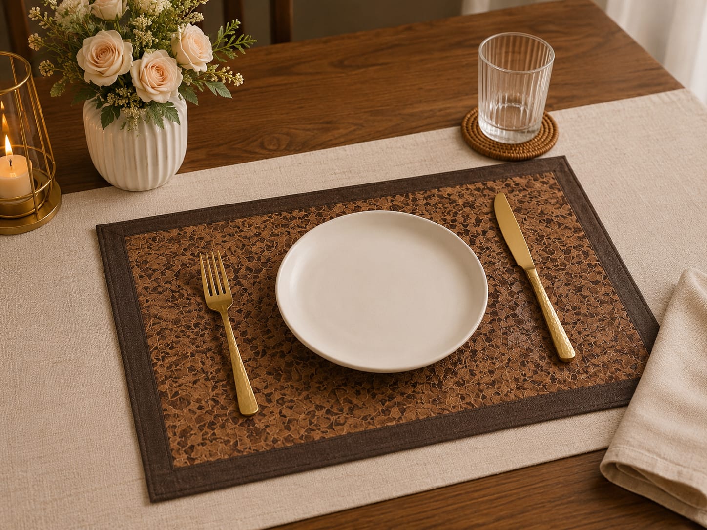
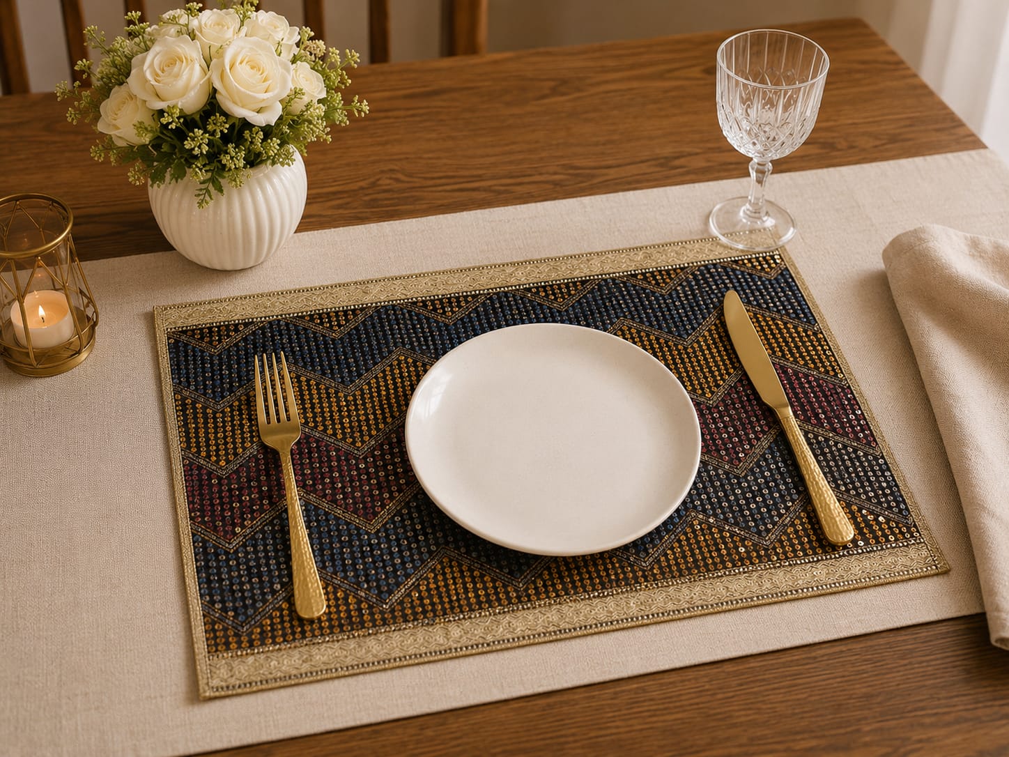
    <p>Premium Table Mats designed for modern homes & restaurants</p>
  </div>
</section>

<!-- COLLECTIONS -->
<section id="collections" class="section">
  <h2>Our Collections</h2>

  <div class="grid large-grid">

    <div class="card image-card">
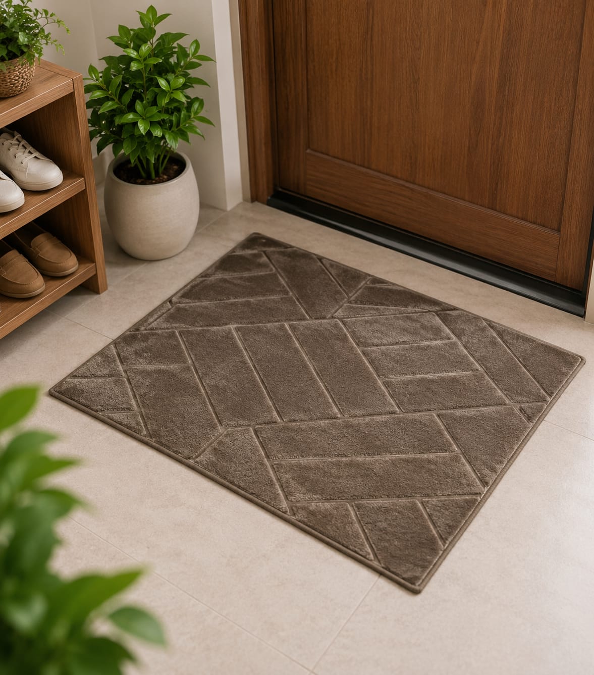
      <img src="images/lifestyle/doormat.jpg">
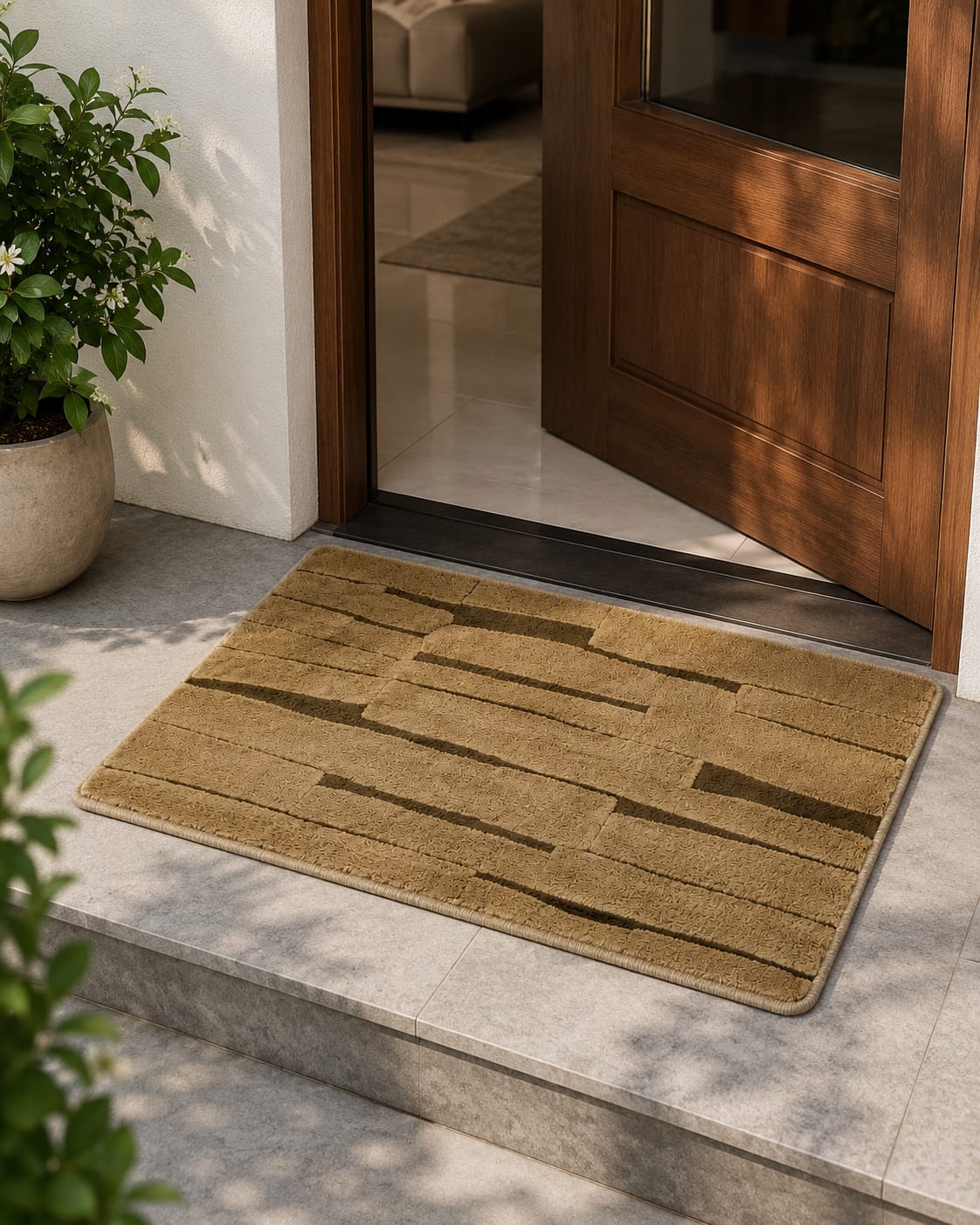
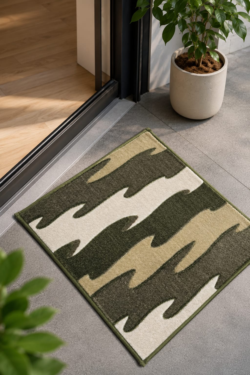
      <h3>Premium Doormats</h3>
    </div>

    <div class="card image-card">
      <img src="images/lifestyle/table.jpg">
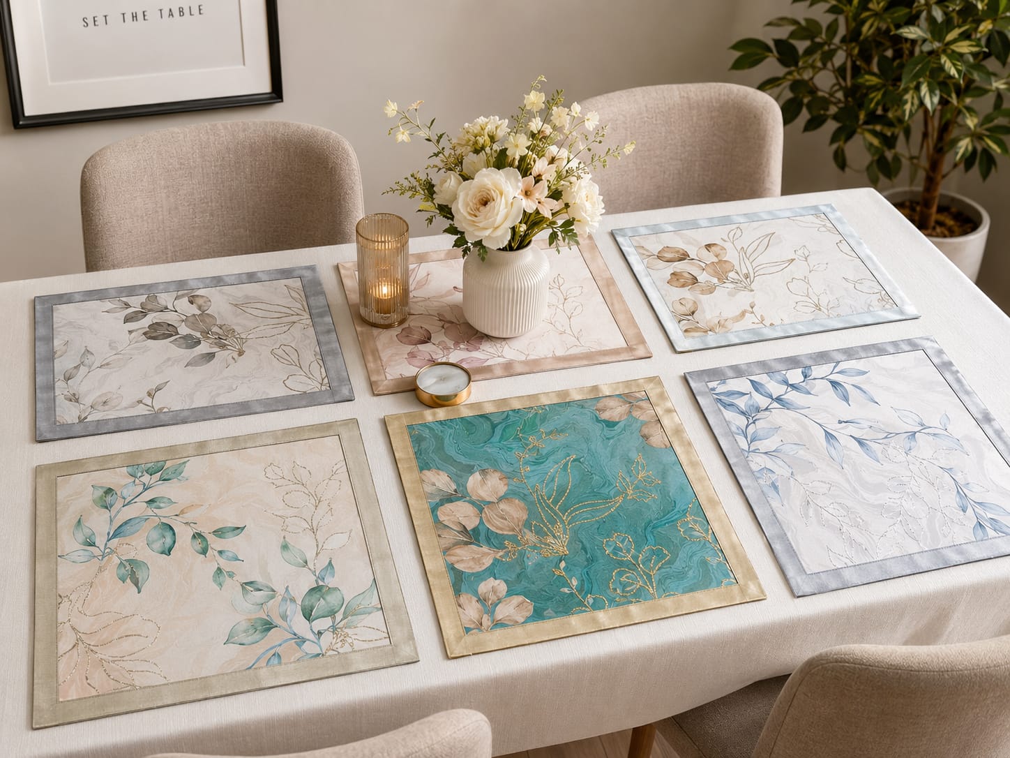
      <h3>Table Mats</h3>
    </div>

    <div class="card image-card">
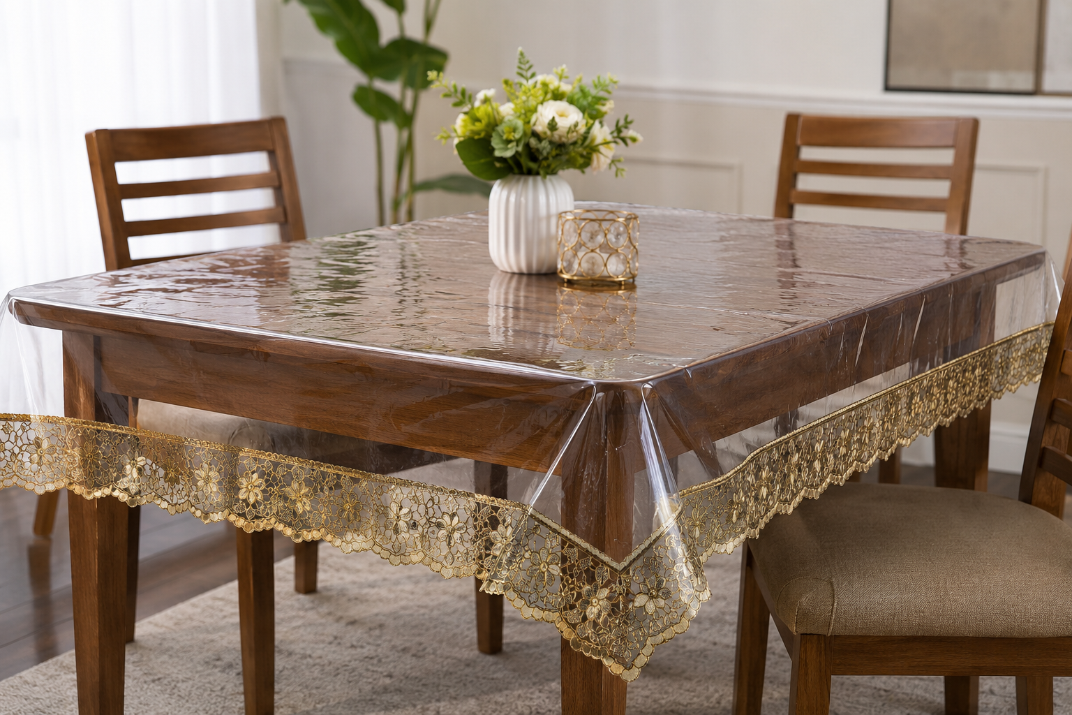
      <img src="images/lifestyle/cover.jpg">
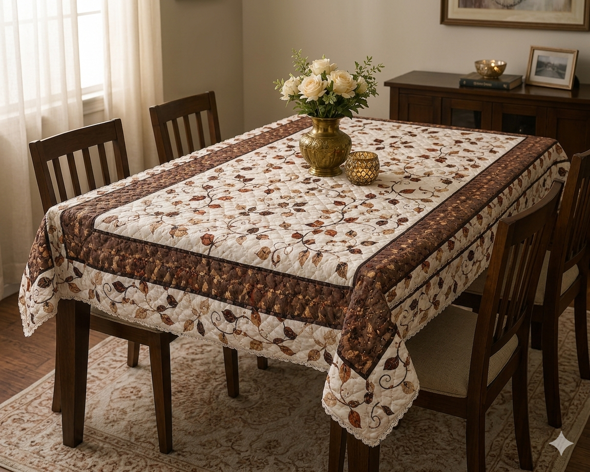
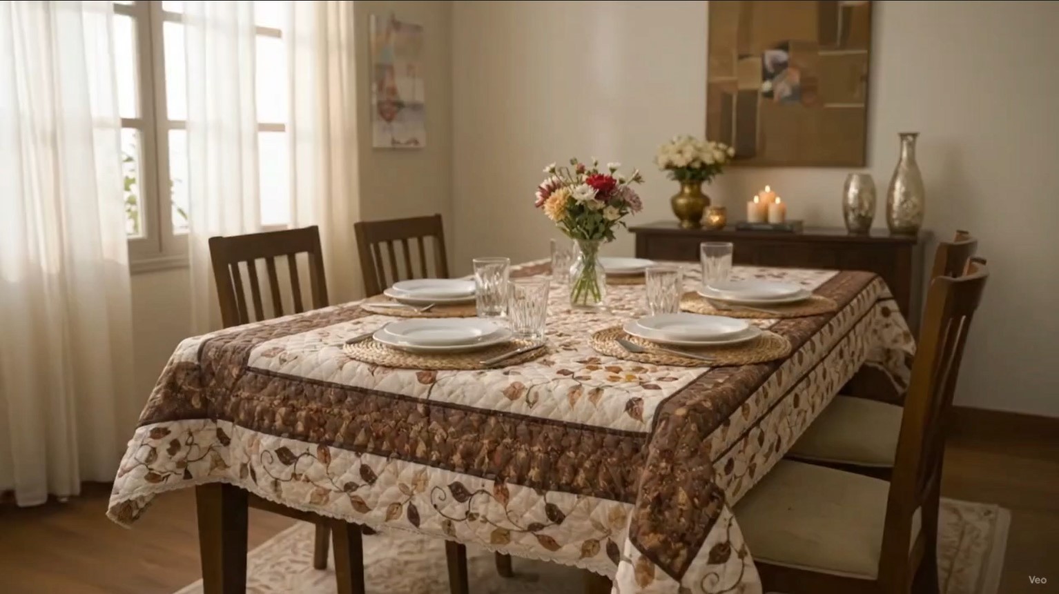
      <h3>Table Covers</h3>
    </div>

    <div class="card image-card">
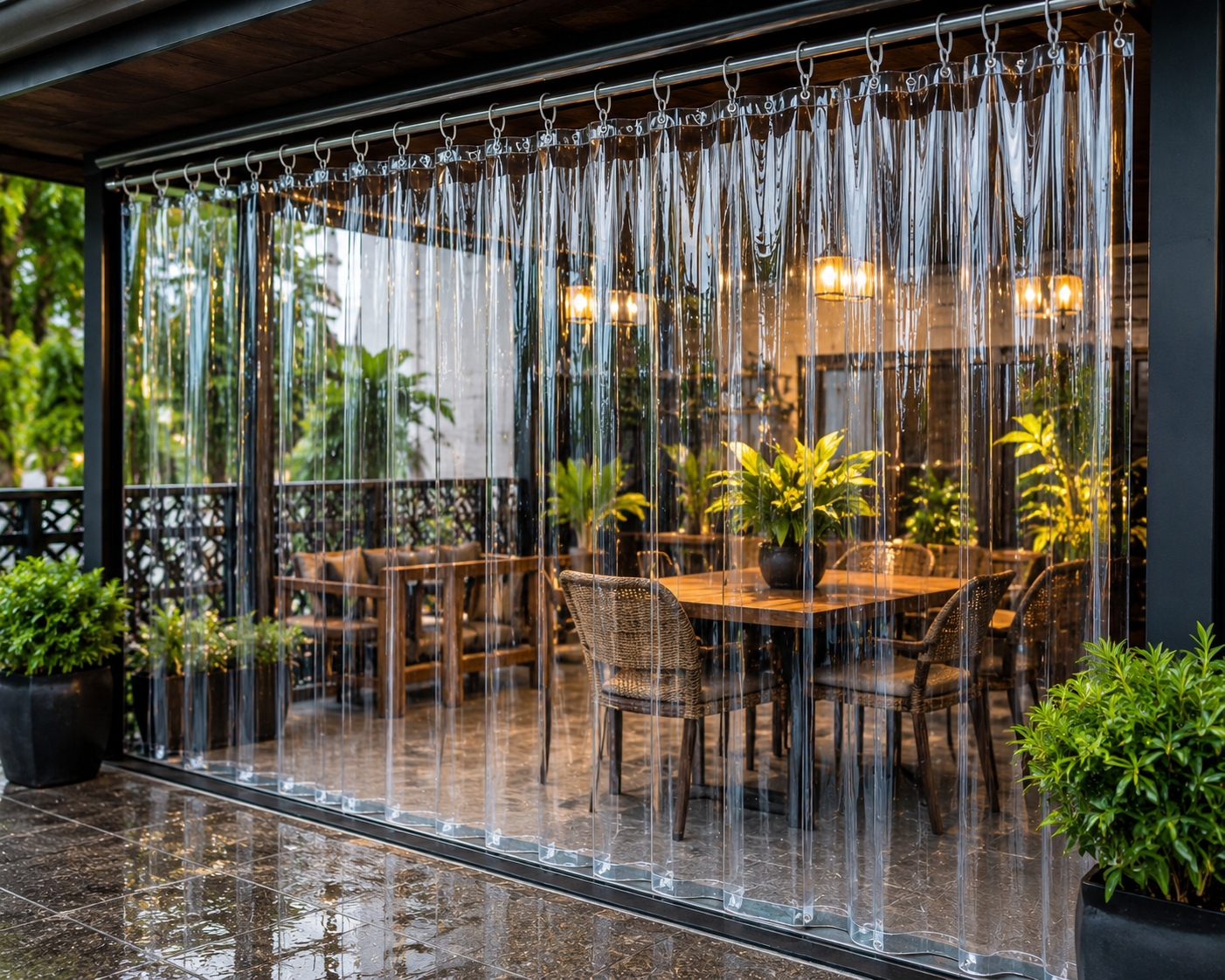
      <img src="images/lifestyle/curtain.jpg">
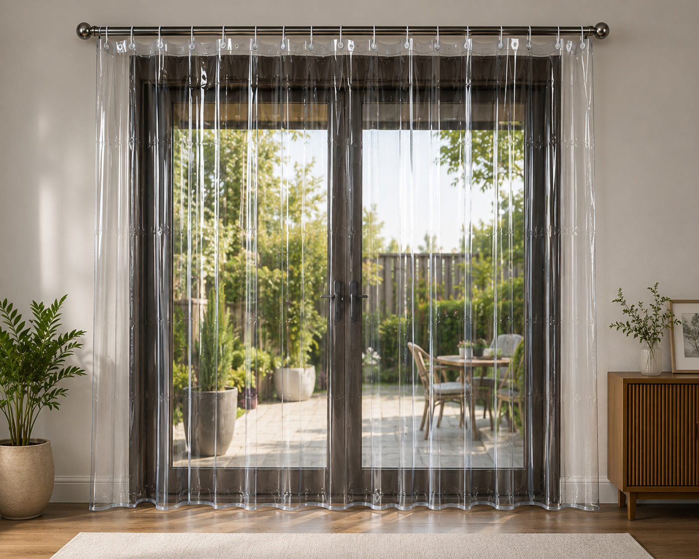
      <h3>Curtains</h3>
    </div>

  </div>
</section>

<!-- LIFESTYLE BANNER 2 -->
<section class="banner video-banner">

  <video class="banner-video" autoplay muted loop playsinline preload="metadata">
    <source src="images/lifestyle/entrance.mp4" type="video/mp4">
  </video>

  <div class="banner-overlay"></div>

  <div class="banner-text">
    <h2>Durable Entrance Doormats</h2>
    <p>Designed for heavy Indian usage & easy cleaning</p>
  </div>

</section>

<!-- PRODUCTS -->
<section id="products" class="section">
  <h2>Best Selling Products</h2>

  <div class="grid">

    <div class="card">
      <img src="images/CoverPic/Doormat.jpg">
      <h3>Premium Doormat</h3>
      <button onclick="window.location.href='https://wa.me/917045208383'">
        Enquire Now
      </button>
    </div>

    <div class="card">
      <img src="images/CoverPic/Tablemat.jpg">
      <h3>Table Mat Set</h3>
      <button onclick="window.location.href='https://wa.me/917045208383'">
        Enquire Now
      </button>
    </div>

    <div class="card">
      <img src="images/CoverPic/TableCover.png">
      <h3>Table Cover</h3>
      <button onclick="window.location.href='https://wa.me/917045208383'">
        Enquire Now
      </button>
    </div>

    <div class="card">
      <img src="images/CoverPic/PVC Curtain.png">
      <h3>PVC Curtain</h3>
      <button onclick="window.location.href='https://wa.me/917045208383'">
        Enquire Now
      </button>
    </div>

  </div>
</section>

<!-- INSTAGRAM STYLE GALLERY -->
<section class="gallery">
  <img src="images/gallery/1.jpg">
  <img src="images/gallery/2.jpg">
  <img src="images/gallery/3.jpg">
  <img src="images/gallery/4.jpg">
  <img src="images/gallery/5.jpg">
  <img src="images/gallery/6.jpg">
</section>

<!-- WHY US -->
<section class="section">
  <h2>Why Choose Home Collection Decor</h2>

  <div class="grid">

    <div class="card">
      <h3>Premium Quality</h3>
      <p>Long lasting materials</p>
    </div>

    <div class="card">
      <h3>Pan India Supply</h3>
      <p>Trusted by 500+ retailers</p>
    </div>

    <div class="card">
      <h3>Fast Response</h3>
      <p>Instant WhatsApp support</p>
    </div>

  </div>
</section>

<!-- ABOUT VISUAL -->
<section class="banner">
  <img src="images/lifestyle/warehouse.jpg">
  <div class="banner-text">
    <h2>Trusted Wholesale Supplier Since 2007</h2>
    <p>Quality • Consistency • Reliability</p>
  </div>
</section>

<!-- CONTACT -->
/* =========================
   CONTACT SECTION (PREMIUM CLEAN UI)
========================= */

#contact{
  background: #fafafa;
  padding: 80px 20px;
  text-align: center;
}

#contact h2{
  font-size: 28px;
  margin-bottom: 30px;
  font-weight: 600;
}

/* FORM CARD */
#contact form{
  max-width: 520px;
  margin: 0 auto;

  background: #fff;
  padding: 28px;
  border-radius: 18px;

  box-shadow: 0 10px 30px rgba(0,0,0,0.08);
  border: 1px solid #eee;

  display: flex;
  flex-direction: column;
  gap: 14px;
}

/* INPUTS */
#contact input,
#contact textarea{
  width: 100%;
  padding: 14px 16px;

  border: 1px solid #ddd;
  border-radius: 10px;

  font-size: 14px;
  outline: none;

  transition: 0.2s ease;
  font-family: inherit;
}

/* FOCUS STATE */
#contact input:focus,
#contact textarea:focus{
  border-color: #25D366;
  box-shadow: 0 0 0 3px rgba(37,211,102,0.12);
}

/* TEXTAREA */
#contact textarea{
  min-height: 120px;
  resize: none;
}

/* BUTTON */
#contact button{
  background: #25D366;
  color: #fff;
  font-weight: 600;

  padding: 14px;
  border-radius: 10px;
  border: none;

  cursor: pointer;
  transition: 0.25s ease;
  font-size: 14px;
}

#contact button:hover{
  background: #1ea952;
  transform: translateY(-2px);
}

/* MOBILE */
@media (max-width:768px){
  #contact form{
    padding: 18px;
  }
}

/* =========================
   PRODUCT SECTION UPGRADE (CONVERSION FOCUSED)
========================= */

.product-card h3{
  font-size:15px;
  font-weight:600;
  margin-bottom:6px;
  color:#111;
}

.product-card .subtext{
  font-size:12.5px;
  color:#777;
  margin-bottom:12px;
  line-height:1.4;
}

/* make cards feel more clickable */
.product-card{
  transition:0.25s ease;
  cursor:pointer;
}

.product-card:hover{
  transform:translateY(-6px);
  box-shadow:0 14px 30px rgba(0,0,0,0.12);
}

/* stronger CTA feel */
.product-card button{
  background:#111;
  font-weight:600;
  letter-spacing:0.4px;
}

.product-card button:hover{
  background:#25D366;
}

<footer>
  <p>© 2026 Home Collection Decor</p>
</footer>

<script>
document.addEventListener("DOMContentLoaded", function () {

  const video = document.getElementById("heroVideo");
  const loader = document.getElementById("heroLoader");
  const pageLoader = document.getElementById("pageLoader");

  function showSite() {
    video.classList.add("loaded");
    loader.classList.add("hide");

    if (pageLoader) {
      pageLoader.classList.add("hide");
    }
  }

  // Best trigger
  video.addEventListener("canplaythrough", showSite);

  // fallback safety
  video.addEventListener("loadeddata", showSite);

  // emergency fallback
  setTimeout(showSite, 6000);

});
</script>
  
</body>
</html>